Moodboard · Higgsfield × Gentle Monster → ALTE

Cinematic ALTE — The Ink Screening Room.

Кинематографичная тёмная сцена, гигантская Sora, один коралловый акцент, видео-первый интерфейс. Энергия Higgsfield/Gentle Monster — в палитре ALTE, без радужного неона.
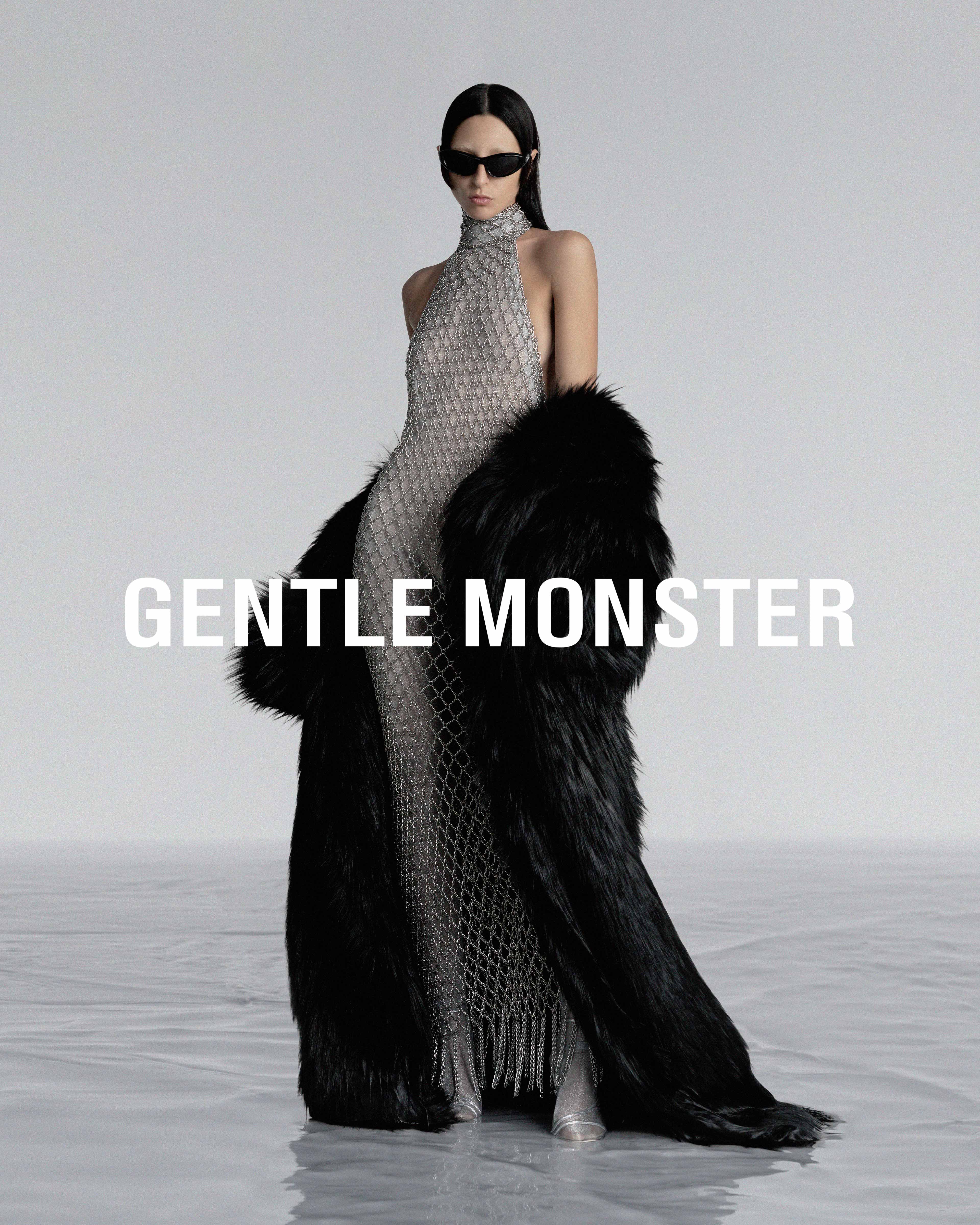
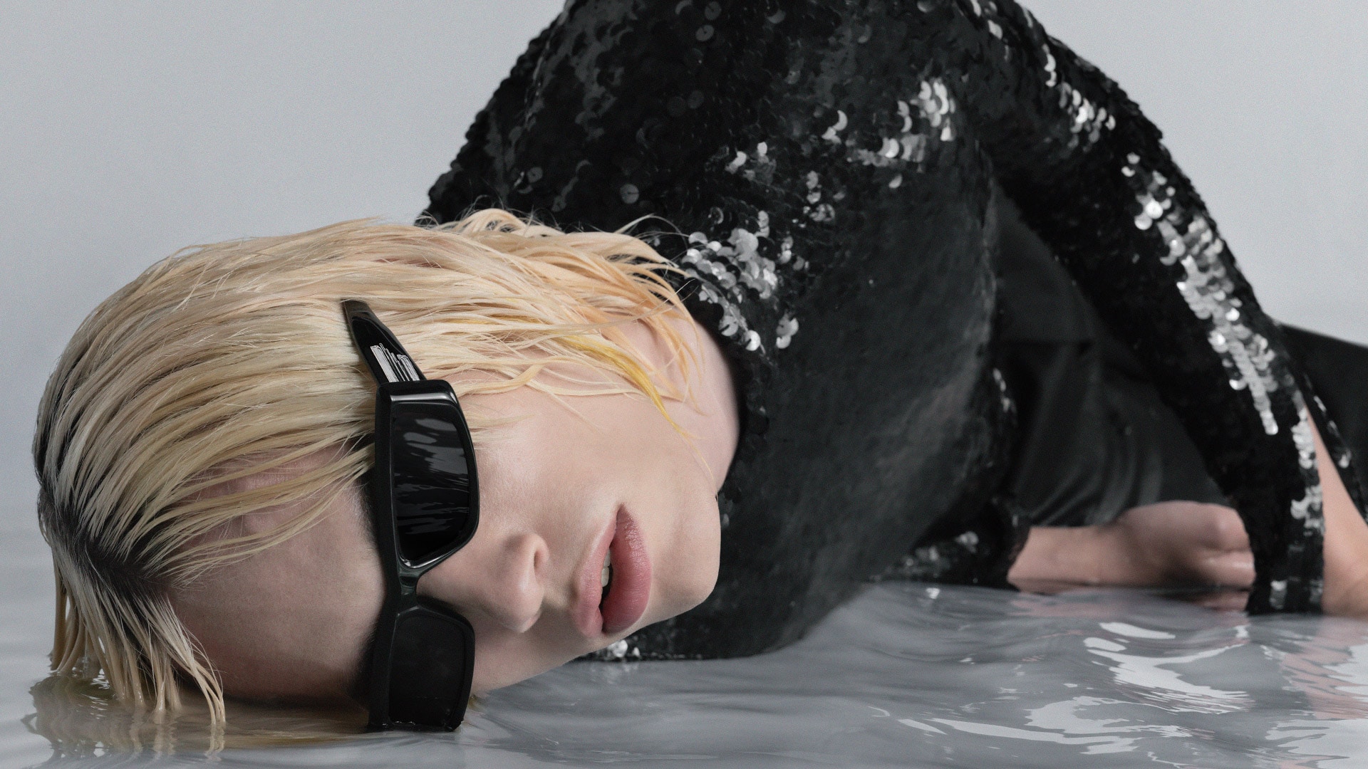
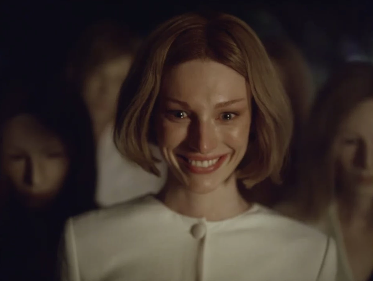
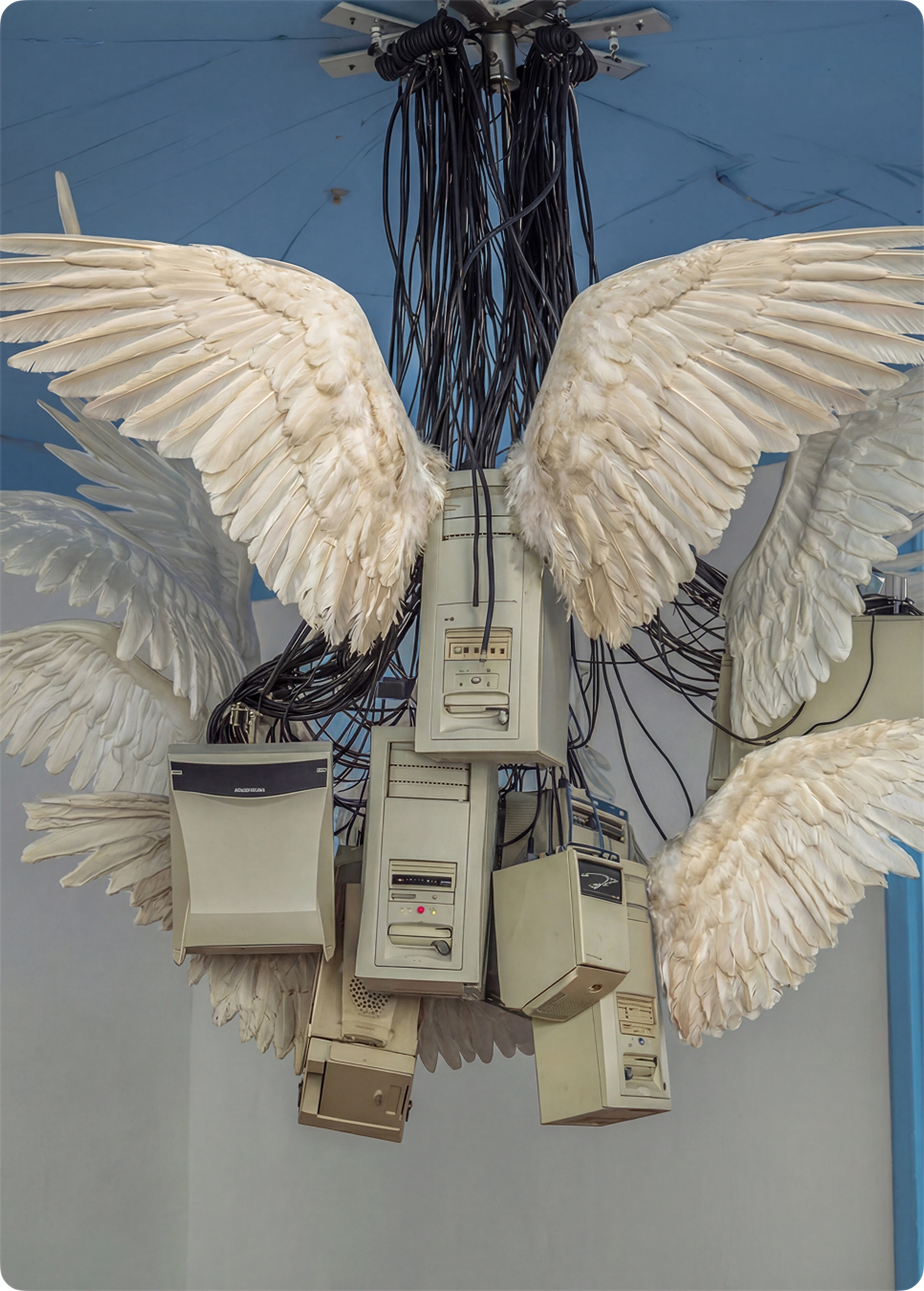
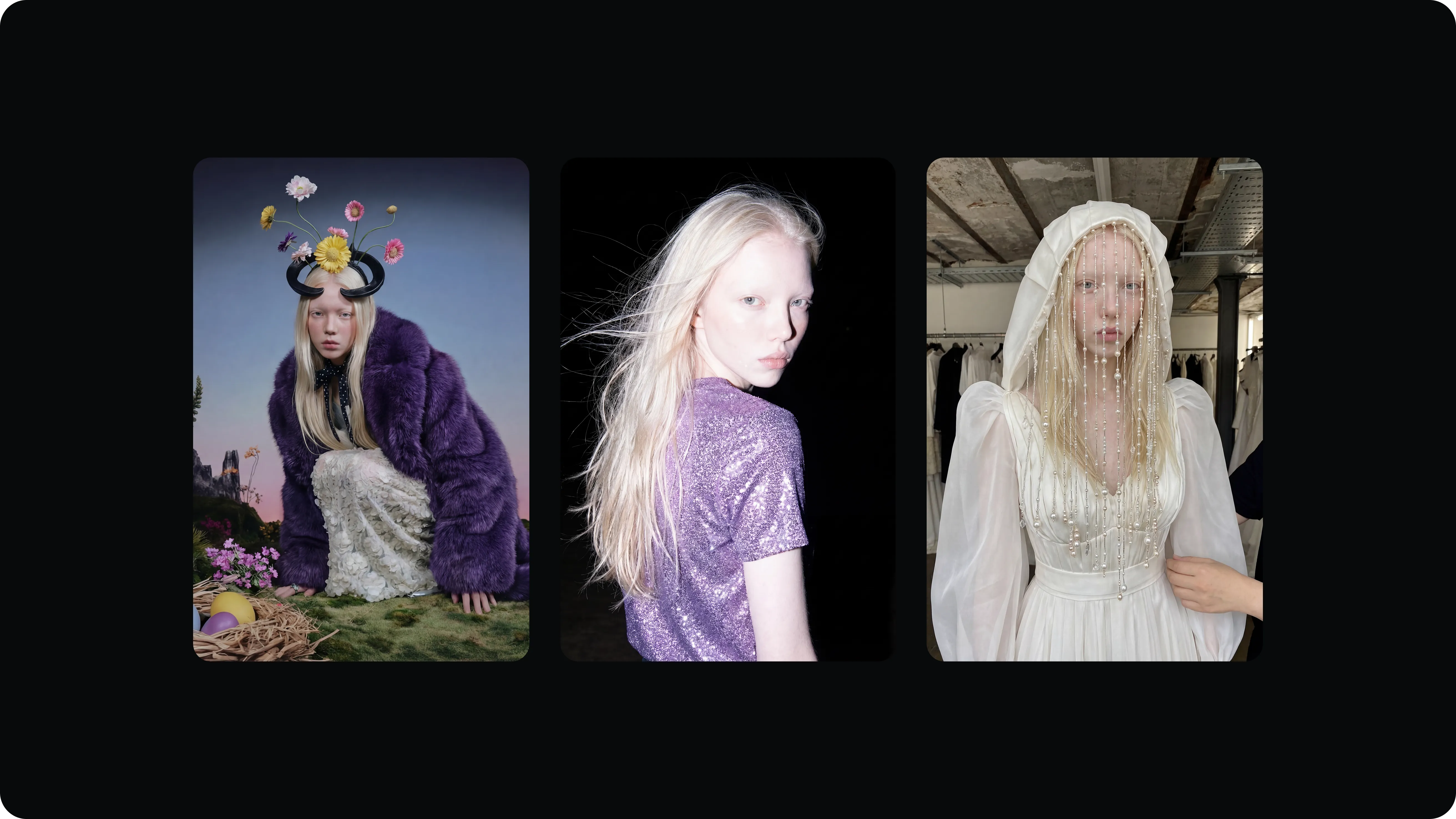
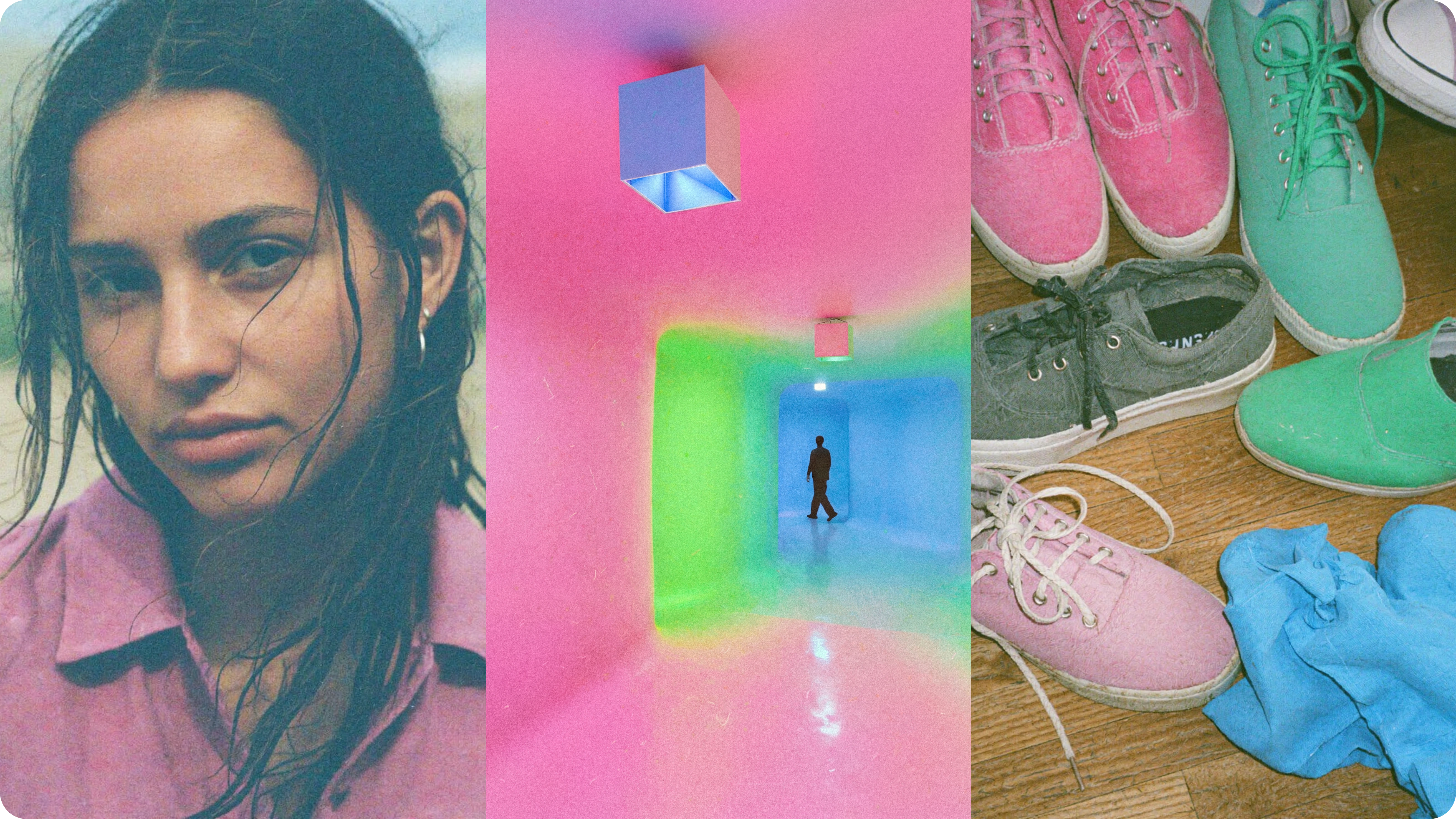
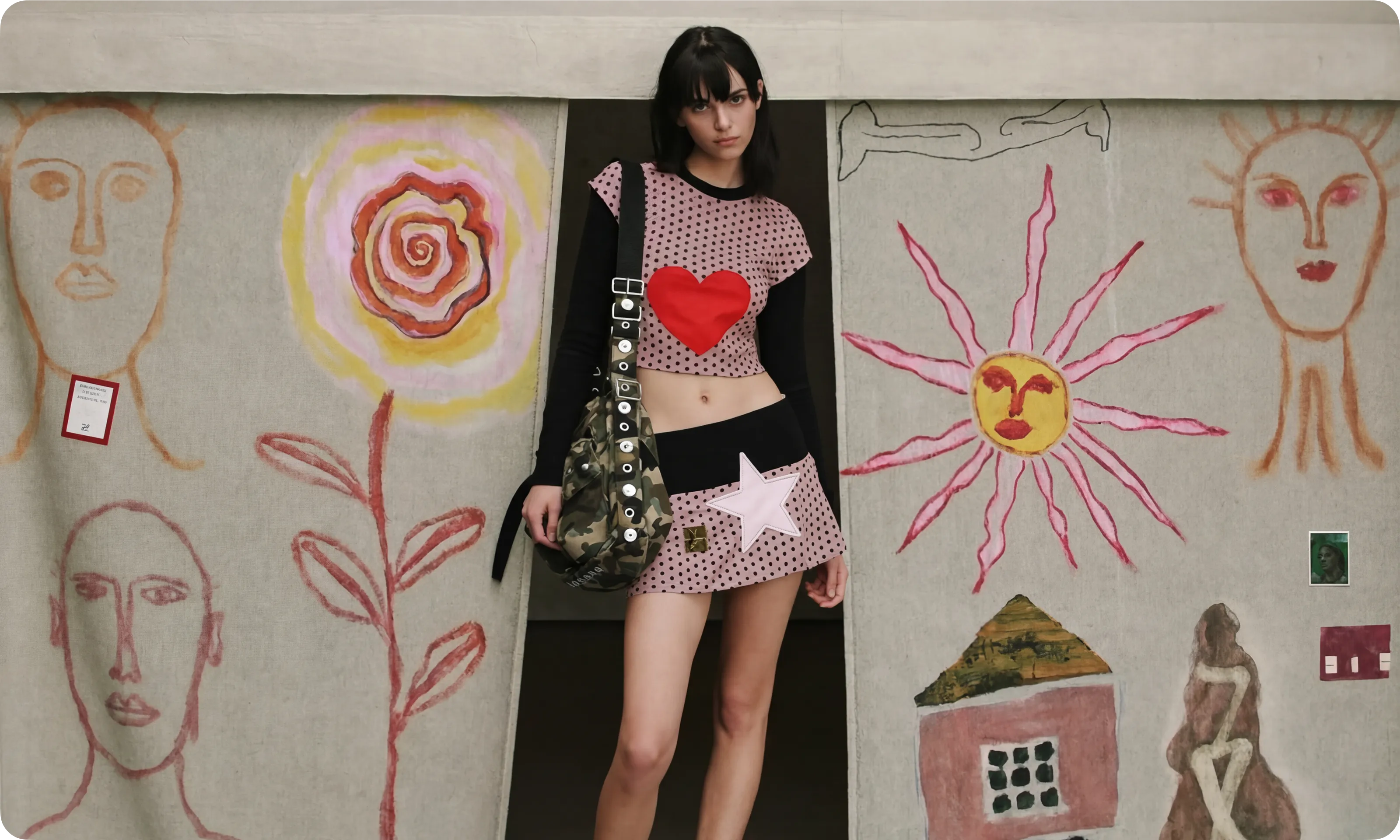
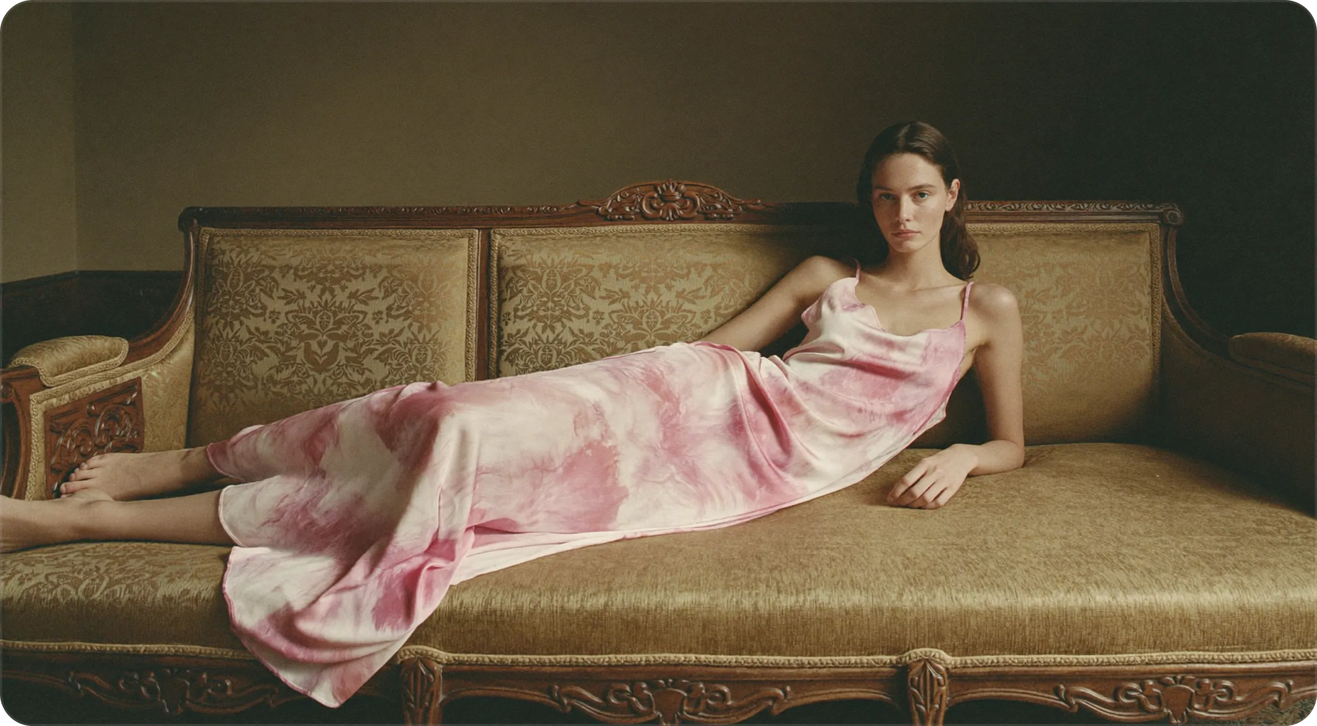
Референс-стена

54 рефов · клик → открыть источник · битые подгрузки скрываются сами

Design DNA

12 приёмов, что делают этот вайб — и как их применить к Lab
01Media Is The Only Color
The product chrome stays near-monochrome and near-black so the generated video frame is the single saturated thing on screen. Linear runs ~#010102 canvas with desaturated UI; every AI tool studied (Runway, Luma, Krea, Higgsfield) does the same — the dark field is what makes generated thumbnails glow and read cinematic.
В наш Lab → Build the entire Lab in the ALTE ink ramp (Ink Deep #0A1426 canvas → Ink Blue #14213D panels) with Cream text. NEVER place a coral or plum fill directly adjacent to a preview thumbnail — let the user's rendered clip supply 100% of the saturation. The desaturated shell is what reconciles 'cinematic glow' with ALTE's 'flat color, no neon' rule.
02The Preview Stage
AI video tools give the output its own dark 'screening room': a centered, padded, slightly-rounded, letterboxed media surface sitting on the darkest available surface so its edges glow against the void. Krea splits canvas-left/output-right; Luma centers the result on a board. Transport controls live OUTSIDE the media rectangle so nothing covers the frame.
В наш Lab → Center the generated clip on an Ink Deep #0A1426 stage with generous padding (15-20vh of breathing room), 8-12px corner radius, optional 2.39:1 letterbox bars. Keep scrub bar, model picker, aspect toggle, and Generate button in a control cluster below or beside the frame — never overlaid on the video itself.
03One Rationed Accent
Both worlds converge here: GM uses a single saturated jolt against monochrome (Nano's vivid red); Linear rations its lavender-blue to ~one primary action per screen; Higgsfield reserves its one neon strictly for CTAs and New/Premium badges. The accent reads as energy precisely because everything else is desaturated.
В наш Lab → Coral #FF7849 is the ONLY accent and it stays ≤10% coverage — reserved for the single primary action per view (Generate / Run / Publish) plus live-state cues (active scrub head, recording dot, 'New' pill). This is where ALTE's brandbook and the cinematic refs already agree: restraint = premium. Coral replaces the refs' literal cyan/neon. Secondary actions are ghost/hairline-neutral.
044-Step Surface Ramp, Hairlines Not Shadows
Linear builds depth from a narrow 4-step lightness band — background → foreground → panel → dialog — separated by 1px inset borders at low white-alpha plus a soft shadow, NOT heavy drop shadows or glows. This keeps a dense tool legible without visual noise.
В наш Lab → Define 4 ink surfaces in a tight band: Ink Deep #0A1426 (canvas/stage) → #0F1A33 → Ink Blue #14213D (panels) → #1B2A47 (modals/popovers). Separate regions with 1px Ink Mist #4A5878 borders at ~15-25% alpha, never with big gaps. Glows are forbidden by the ALTE book anyway — this gives cinematic depth without breaking it.
05Cinematic Preset Cards (Looping Video, Named Moves)
The signature Higgsfield pattern, validated as the daily-use bridge: a responsive grid of cards, each an autoplay-muted-LOOPING video thumbnail with a poster-frame underneath, an UPPERCASE name drawn from real camera/VFX language (Crash Zoom Out, 360 Orbit, Dolly In, Bullet Time, FPV Drone), a small Premium/New pill, and a 'by [creator]' byline. Ship taste as named presets, not raw parameter fields.
В наш Lab → Make the Lab preset-first. Build a 3-4 col grid of cards floating on Ink Deep; still poster paints instantly (webp q85), hover swaps to a looping clip. Sora-cased uppercase label, optional coral 'New' pill, one-tap Generate. Mark a few 'Top Choice'. This is the highest-impact borrow — it turns the model into a browsable catalog of big-budget-looking shots.
06Full-Bleed Looping Hero
Across all four sweeps the first viewport is 100vw×100vh of muted, autoplaying, looping footage (or WebGL), no chrome, with a 30-60% dark gradient/vignette over it so light type stays legible. The hero IS the brand statement; copy reduces to one line. GM letterboxes it ~2.39:1 and reveals product late.
В наш Lab → Lab landing / empty-state leads with one strong full-width loop of a flagship generated clip behind a single Sora tagline. Lazy-swap a poster frame for fast LCP. Layer an Ink Deep→transparent gradient so Cream type holds. Every feature/empty block carries its own auto-playing demo clip rather than a static screenshot — the page reads as a showreel.
07Film Grain + Analog Texture
The single cheapest move that makes a dark surface feel 'shot' rather than 'designed': a fixed full-screen grain/noise layer at 4-10% opacity, pointer-events:none, mix-blend overlay/soft-light. It unifies video + flat UI under one filmic skin AND kills banding in dark gradients. GM leans on it heavily (Petra Collins halation, art-cinema grain).
В наш Lab → Add a global animated grain overlay (~5-7% opacity, soft-light) above the Ink canvas and below interactive layers. This is the one texture that gives ALTE's flat ink fields cinematic life without introducing a gradient or neon — fully compatible with the brandbook, since grain is texture, not chromatic gradient. Honor prefers-reduced-motion by freezing it.
08Gallery-Not-Store / Product As Artifact
GM's core move: treat the hero object as a relic on a plinth, not merchandise — vast negative space, museum isolation, one focal element per viewport, no price/CTA clutter crowding it. The void is a compositional element (Cosmos, Darkroom). Emptiness makes type and footage feel expensive and lets slow reveals land.
В наш Lab → Reserve the generosity for the stage: one clip, huge dark margins, big vertical padding (15-25vh) between sections, nothing competing in the focal viewport. Counterbalance with tight control lists elsewhere (see density principle). When showcasing a finished render, isolate it like an artifact — center, breathe, no surrounding chrome.
09Oversized Sora Display vs. Tight Inter Body
Two-tier type. The 'cinematic/bold' lives only in big moments — heroes, empty states, section eyebrows — set huge (12-30vw on marketing, large in-app for headlines) with tight tracking and line-height ~0.9. The working UI uses a small, tight neutral grotesk at 12-14px for density. Honest note: in both GM and Higgsfield the motion lives in the VIDEO, not in animated letterforms — type is strong, confident sans, not experimental kinetic.
В наш Lab → Sora is the expressive display face — oversized for the hero tagline, empty states, and UPPERCASE micro-labels/eyebrows/preset names (small-caps treatment). Inter at 12-14px tight for all dense control, list, and panel text. Resist oversized type inside working views. ALTE's existing Sora×Inter pairing maps onto this two-tier system perfectly — no new fonts needed.
10Slow, Confident, Quiet Motion
GM's motion is ease-heavy, low-frequency, long holds — 'exhibition' pacing, never bouncy. Premium web uses 0.6-1.2s expo/cubic-bezier page transitions and deliberate loaders. Pro-tool craft (Linear/Arc/Framer) keeps UI micro-transitions to ~120-200ms and reserves the only SUSTAINED motion for the user's looping media, so chrome never competes with content.
В наш Lab → Two motion speeds: (1) quiet UI micro-transitions 120-200ms eased on hover/panel-slide/focus — no bounce; (2) slow cinematic moments 0.6-1.0s expo easing for stage reveals, generate-complete transitions, and overlay wipes. The looping preview clips are the only continuous motion. Always honor reduced-motion.
11Asymmetric Editorial Grid
Break the centered-SaaS layout: a 12-col grid with deliberately off-balance placement — headline hard-left, caption dropped low-right, large index numbers (01/02), thin hairline rules, small-caps eyebrows. One giant element against tiny meta text creates magazine-style scale tension. Reads as a printed art-book, not a landing page (Cosmos, GM's BOLD page).
В наш Lab → Lay out the Lab's marketing surfaces and gallery/board views on an asymmetric 12-col grid: off-center hero, low-right captions, monospace/Sora index numerals on preset sections, Ink Mist hairline rules between blocks. Alternate full-bleed hero loops with bento showcase grids and 3-4 col feature cards to keep the catalog organized but editorial.
12Dense Chrome, Auto-Hiding Nav
The daily-use discipline: Arc tucks everything into one auto-hiding vertical sidebar so the content area is borderless and maximal; Linear separates dense regions with 1px hairlines not whitespace. Reserve glassmorphism (translucent backdrop-blur) ONLY for floating/transient panels over media — keep persistent panels solid for legibility. Whitespace is for the stage; control lists stay tight.
В наш Lab → Collapse secondary nav into an auto-hiding sidebar so the stage + controls own the screen. Use dark glass (Ink Blue at ~70% + backdrop blur) only for floating camera/style/preset panels that hover over the preview; keep persistent panels solid Ink Blue. Tight control lists, hairline separators — spend the negative space on the stage, not the toolbars.

Направление «Cinematic ALTE — The Ink Screening Room»

Палитра, типографика, motion, текстура, лейаут
Ink Deep
#0A1426
Primary canvas + the preview stage (darkest surface; the void the media glows against)
Obsidian Ink
#060C18
Added near-black for full-bleed hero letterbox bars, vignette base, and grain bed — deeper than Ink Deep to read as 'pure screening-room black' without going to dead #000
Ink Blue
#14213D
Panels, cards, persistent toolbars (surface step 3 in the elevation ramp)
Ink Raise
#1B2A47
Added elevated surface for modals, popovers, hovered cards (surface step 4); a slight lift from Ink Blue, not a glow
Ink Mist
#4A5878
Hairline borders (15-25% alpha), inactive icons, secondary meta text, index numerals
Warm Cream
#F4F1EA
Primary type + active icons; the high-contrast 'light' against the ink field (never pure white — keeps it filmic, not clinical)
Coral
#FF7849
THE single rationed accent ≤10% — primary action (Generate/Run/Publish), live scrub head, 'New' pill, recording dot. Nothing else is saturated.
Plum
#4A3A5C
Sparing tonal support for category tags / preset-family chips and selected-state fills — used flat, desaturated, as a quiet second-tier marker, NEVER as an electric-purple glow or gradient
Типографика

Sora (display) × Inter (UI), exactly per ALTE — no new faces. TWO TIERS. Tier 1, Sora expressive: hero tagline 8-14vw on landing / 40-72px in-app empty states, tracking tight (-1 to -2%), line-height 0.9-0.95, weight 600-700. Sora also carries all UPPERCASE micro-labels — section eyebrows, preset names, badges — at 11-13px, letter-spacing +8 to +12%, small-caps feel (this is the recurring 'texture' borrowed from Higgsfield's preset overlays and GM's quiet section labels). Tier 2, Inter workhorse: all dense working text — control panels, list rows, prompt fields, metadata — at 12-14px, regular/medium, tight line-height ~1.3. Hard rule: oversized type NEVER enters a working view; 'bold/cinematic' lives in heroes, empty states, onboarding, and preset overlays only. Motion comes from the video, NOT animated letterforms — keep mask-reveals on the hero headline subtle (single translateY clip-path on load), not a kinetic-type showcase.

Motion

Two clocks. (1) QUIET UI — 120-200ms ease-out on hover, panel slide, focus, toggle; preset card poster→loop swap cross-fades ~150ms on hover; no bounce, ever. (2) CINEMATIC MOMENTS — 0.6-1.0s expo / custom cubic-bezier(0.16,1,0.3,1): stage reveal when a render completes (media fades + scales from 0.96→1 with a slow Coral scrub-head sweep), full-screen Ink overlay wipe on view transitions, a deliberate 0-100 loader on first app load. Scroll-driven staggered reveals on marketing/gallery (IntersectionObserver fade+translateY, slow). In-viewport autoplay only — galleries play when scrolled into view for performance. The looping preset/preview clips are the ONLY sustained motion; all chrome motion stays quiet so media wins. Honor prefers-reduced-motion (freeze grain, disable autoplay, cut transitions to opacity).

Текстура

Global film-grain overlay: tiling animated noise at 5-7% opacity, mix-blend-mode soft-light, pointer-events:none, fixed full-screen, above the Ink canvas and below interactive UI. Implemented via SVG feTurbulence or a tiling PNG flickering on steps(). This is the keystone reconciliation move — it gives ALTE's mandated FLAT ink fields genuine cinematic life and kills gradient-banding in the dark stage WITHOUT introducing any chromatic gradient or neon, so it is fully brandbook-legal (grain is texture, not color transition). Add a very subtle radial vignette (Obsidian Ink → transparent) on the hero and stage to focus the eye. NO bloom/glow on UI elements — the grain + vignette do the filmic work that glow would otherwise do.

Лейаут

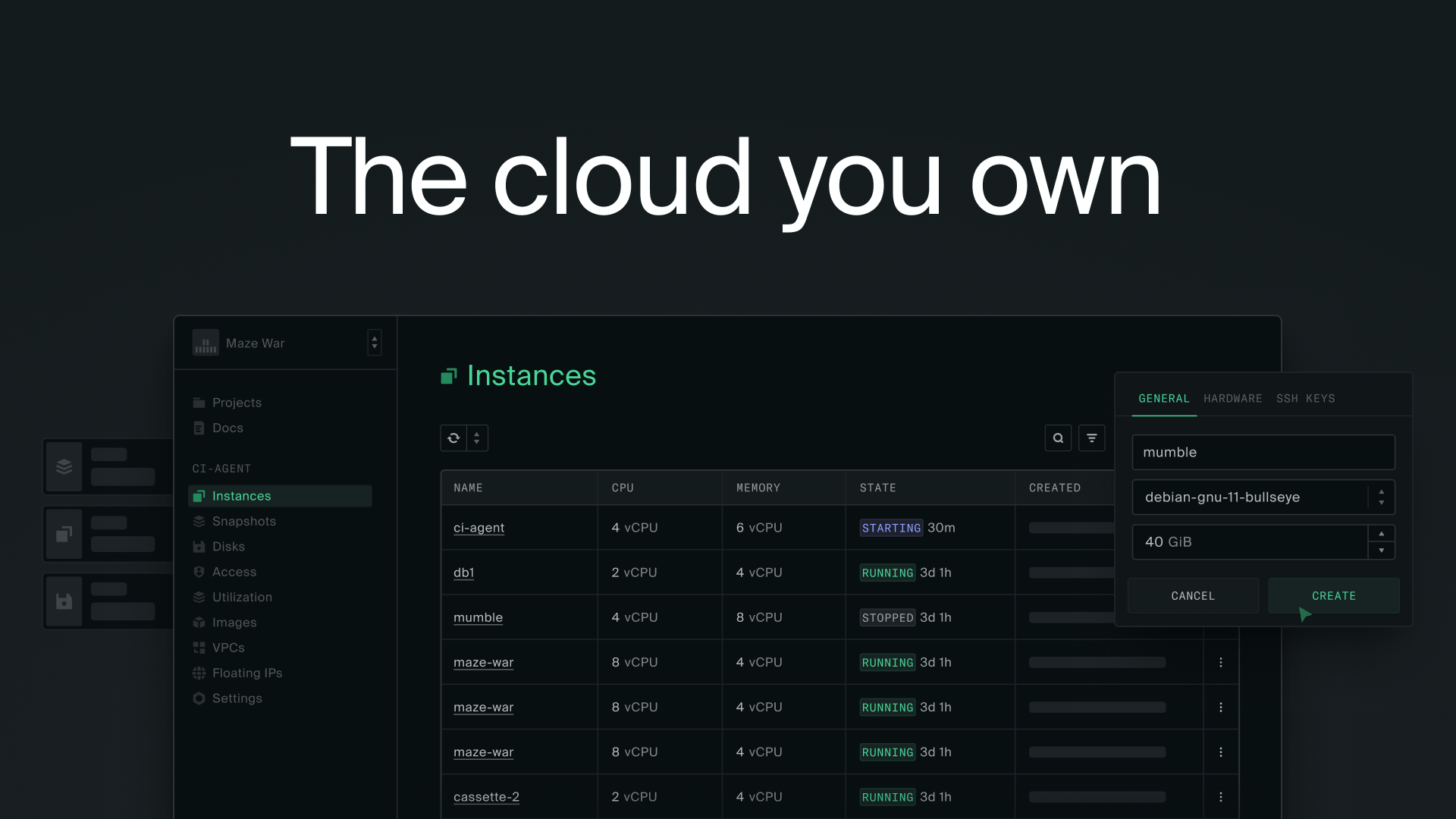
THE STAGE + TIGHT CONTROLS. Center column is the Screening Room: the generated clip on an Ink Deep stage, 8-12px radius, optional 2.39:1 letterbox bars, 15-20vh breathing room, slight Obsidian vignette so edges glow against the void — controls (scrub, transport, aspect, model picker, Generate) live OUTSIDE the frame in a bottom control cluster. LEFT: auto-hiding Arc-style vertical sidebar for nav/projects so the stage stays maximal. RIGHT (or bottom): a Luma-style Board / conversational iteration rail — outputs collect into a spatial board, 'reply with a tweak' refines, history persists. ENTRY POINT is preset-first: a 3-4 col grid of cinematic preset cards (looping video, UPPERCASE Sora label, Coral 'New' pill, by-creator byline, one-tap Generate) floating on Ink Deep — named after real camera moves so pros get an instant mental model. Dark glass (Ink Blue ~70% + backdrop blur) ONLY for floating camera/style panels over the media; persistent panels solid. Marketing/landing surfaces use the asymmetric 12-col editorial grid: full-bleed hero loop → bento showcase → 3-4 col feature cards, hairline Ink Mist rules, large index numerals, repeated 'Start Creating' anchors.

⚠ Конфликт с брендбуком

Honest accounting of where the refs break the ALTE book: (1) NEON ACCENT — Higgsfield/immersive-web reserve a bright electric cyan/acid-green for CTAs; ALTE forbids neon and electric purple. Resolution: Coral #FF7849 plays the exact same structural role (one rationed accent for actions/live-state) but is a warm flat brand color, not neon — we keep the pattern, swap the hue. (2) CHROMATIC GRADIENTS / GLOW — refs let dark thumbnails 'glow' and use radial gradient vignettes; ALTE says flat color, no chromatic gradients, no glow. Resolution: achieve the cinematic 'glow' purely via the dark void + film grain + a tonal (single-hue Obsidian→transparent) vignette — a luminance fade, not a chromatic gradient — and never apply glow to UI chrome. (3) LOUD / MEME-NATIVE VOICE — Higgsfield's launch tone is viral-creator loud ('throw away your iPhone', 🧩 glyph); ALTE is premium-through-restraint. Resolution: take Higgsfield's UI ENERGY (preset grid, video-first, density) but GM's quiet-luxury VOICE (hushed, gallery-not-store, late reveal) — restraint is what makes both read premium, not the loudness. (4) RAINBOW EFFECT CATALOGS — Higgsfield preset cards can get chromatically busy; we let the user's media carry all color and keep card chrome monochrome ink.

★ Рекомендация

Push it 80% of the way — adopt the full cinematic STRUCTURE, hold the line on COLOR. Concretely: yes to dark Ink screening-room canvas, full-bleed looping heroes, the looping-video preset grid, film grain, the centered preview stage, oversized Sora moments, asymmetric editorial layout, and slow confident motion — these are the borrows that actually create the premium cinematic read, and none of them require breaking the brandbook. Hold firm on the three things the book forbids and the refs abuse: NO neon (Coral is the only accent, flat and ≤10%), NO chromatic gradients or UI glow (grain + tonal vignette + the dark void do that job), and NO loud meme voice (keep GM's hush). The single highest-leverage move is the film-grain layer: it is the one technique that makes flat ALTE ink read as 'shot on film' rather than 'designed in Figma,' and it is 100% brandbook-compatible. Do NOT chase Higgsfield's neon or its viral tone — that is precisely where it reads cheap; GM proves restraint is the premium signal. Ship preset-first, media-as-only-color, one coral action per screen.

Шрифты

Две гарнитуры ALTE — обе бесплатные (OFL), грузятся с Google Fonts. Sora задаёт характер, Inter держит читаемость.
Sora — заголовки · дисплей · акценты
We build,
not consult.
RegularMediumSemiBoldBoldExtraBold
AaBbCcDd · АаБбВв · 0123456789
H1 / H2 / H3 · UPPERCASE микро-лейблы · имена пресетов (BULLET TIME)
fonts.google.com/specimen/Sora ↗
Inter — body · UI · кнопки
AI products.
Fast. Fixed scope.
LightRegularMediumSemiBold
AaBbCcDd · АаБбВв · 0123456789
Lead (Light) / body / кнопки (SemiBold) / caption · variable 100–900
rsms.me/inter ↗
H1 / HeroCinematic ALTE42px · Sora Medium · lh 1.1
H2 / SectionРеференс-стена30px · Sora Medium · lh 1.2
H3 / SubheadThe Preview Stage22px · Sora Medium · lh 1.3
LeadЭнергия Higgsfield в палитре ALTE16px · Inter Light · lh 1.5
BodyВесь хром тёмный — цвет даёт само видео.14px · Inter Regular · lh 1.6
ButtonСГЕНЕРИРОВАТЬInter SemiBold
Caption54 рефа · клик → источник12px · Inter · lh 1.4

Ссылки-референсы

20 кураторских ссылок — открыть и изучить вживую